Multiple Image Layouts
I'm working on fixing/changing the way #Friendica handles multiple images in a post for the next release. Yes, I'm using AI-slop images for testing purposes on my development server. My apologies to those who don't want to see that garbage.
Masonry Layout
When the backend PHP can get dimensions from the images it uses "masonry" layout. Which work well with even numbers of images but with odd counts of images it currently leaves the last one sort of dangling there by itself:
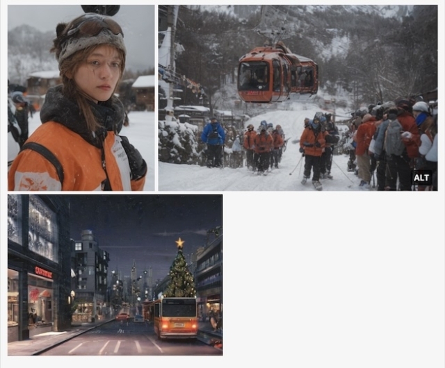
But I think most people would assume it should display like this:
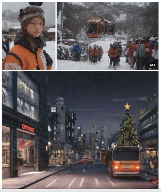
Yes? No? It's a super easy fix if this is what people want.
I'm not yet sure under what circumstances the PHP cannot get image dimensions, but if that's the case then it doesn't use "masonry" layout, it switches to the "grid" template.
PHP Grid Layout (current)
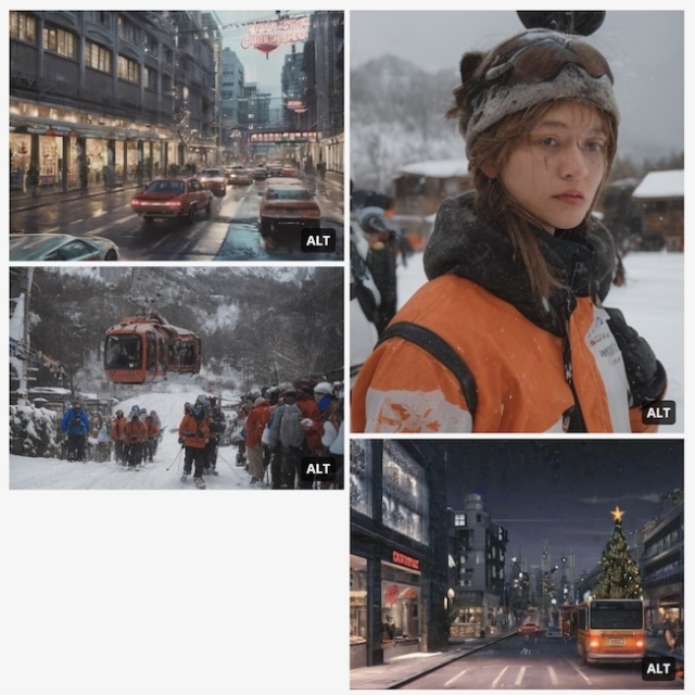
The PHP tries to figure out how many images to show in each column. These are hard-coded HTML column containers.
Pure CSS Grid Layout
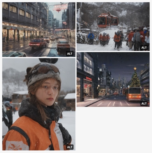
Of course CSS can nicely do columns itself now so there's really no reason to have PHP doing it on the backend. Obviously PHP and CSS don't agree on which images should go in which columns, but this is super easy to implement.
Literal Grid Layout
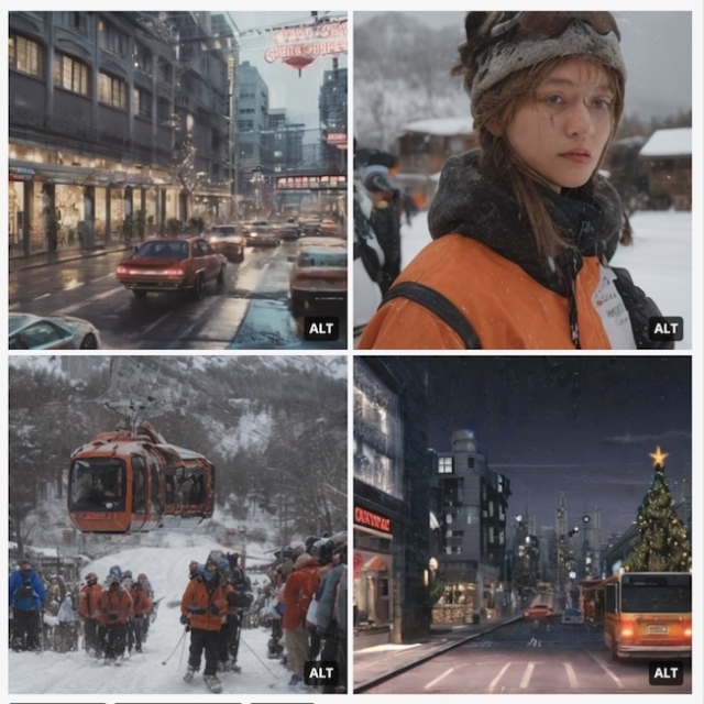
Though when someone says "grid" isn't this more what you are expecting? It doesn't get much more griddy than squares, right? This one uses a combo of PHP and CSS to display the images in a post in your feed similarly to how the thumbnails look in your photo albums.
You may have also noticed the "ALT" in the corners. That is there in the current version of Friendica, but it's just an indicator that an image has alt text, it's not a button like on Mastodon to actually show you the alt text. Well, that's how I ended up looking at these layouts, because I'm also implementing functional alt-text buttons for Friendica. Which means updating all these image layout templates.
Not sure if it will get sorted out for this upcoming release or not, but I'm also working on how to show you the "masonry" and "grid" layouts in the post/edit/comment previews too. THAT is quite a bit trickier because the previews do not use the actual image templates.
I'm interested in any feedback both devs and users want to give me on this. There is also a thread over on the Friendica GitHub if you'd rather comment there.
@Friendica Support @Friendica Developers

Michael 🇺🇦
•Concerning pictures without dimensions: I'm currently unsure if this is a only theoretical or really existing issue.
Random Penguin
•And in case it isn't clear, in the "masonry" layout with 3 images the dimensions of the third image aren't being changed, only the scale, to match the width and span the columns above it.
Michael 🇺🇦
•Tealk
•I don't like that either; information gets lost because you can't tell that the images are being cut off. I'm in favor of always displaying images in their correct aspect ratio, and at most using CSS to adjust the layout.
@Michael 🇺🇦
Hypolite Petovan
•I’m also personally against the literal grid layout because it requires to open images to see them in their original format, which for a reason that will forever escape me, doesn’t work in iOS Add to Home Screen context, where both the Javascript AND the native click events are being fired, resulting in the image opening in the same virtual browser without any navigation controls, which forces me to exit the “app” and open it again.
Random Penguin
•Hypolite Petovan
•To note: it also fails with the New Post button but this leads to the Composer page (instead of just opening the jot) which has navigation, so it isn’t debilitating.
Random Penguin
•The array of images is run through both
array_mapand a "chunk" operation to split it into pairs. If the length of the chunk is "1" it duplicates the one image and lower down in the code gets the dimensions as if there were a duplicate of that image next to it. But the total count for display is still the original count of images so it never actually displays that image twice at the end.Comment out/remove that conditional and the last image is scaled to span the columns above it.
Hypolite Petovan
•Random Penguin
•Matthias
•It is essential that the aspect ratio in the preview is maintained. Cropping the images in the preview should not be the aim.
Matthias
•These examples clearly illustrate the effect that cropping the images has on the view.
It becomes unusable:
Random Penguin
•This is why I ASKED first. 😉